
Creating Vibrant Watercolour Flowers: Tips and Techniques for Painting Roses and Rose Finches
- Naomi Odiwe
- Sep 8, 2025
- 7 min read
Updated: Sep 11, 2025
Watercolour painting is a delightful way to express creativity, especially when it comes to capturing the beauty of flowers. In this blog post, I invite you to watch my new watercolour birds and flowers painting in progress featuring rose blooms, rosebuds, and beautifully coloured rose finches. I share practical tips on how I start my paintings and give step-by-step techniques for getting a painting underway. Whether you’re a beginner or an experienced artist, there’s something here for everyone.
The Beauty of Vibrant Watercolour Roses and Rose Finches
Watercolour flower painting is not just about replicating what you see; it’s about interpreting the beauty of nature through your unique lens, and it's my favourite way to explore my creativity. Roses, with their intricate layers and vibrant colors, provide an excellent subject for this medium. The delicate petals and rich hues can be challenging, but with the right techniques, you can create stunning pieces that capture their essence.
As I embark on any painting journey, I focus heavily on the interplay of light and shadow, which is crucial in bringing flowers to life. Understanding how to manipulate watercolour can transform your artwork from flat to dynamic, and the tips I outline below will really help in this endeavor.
Preparing Your Workspace
Before starting a painting, here are my tips on how to prepare:
Reference Images: I use as many of my own photographic images as possible and also sketch as much as I can from life and nature. If all else fails, there are many online image websites that offer free photographic images, but I try to avoid these if I can. To help with proportions, I use iPhoto to grid up my images quickly and easily. The film below shows how I do this.
How to grid an image in iPhoto easily Materials: An absolute must is high-quality watercolour paper, and I recommend 140lb hot-pressed watercolour paper. I prefer the way watercolours travel on hot-pressed paper compared to cold-pressed. I use an assortment of brushes in a range of sizes. I find that modern synthetic brushes work quite well and are quite a bit cheaper. With regard to mixing palettes, many art suppliers sell either plastic or ceramic mixing palettes, but I find that a white dinner plate is also a good & cheap option. I use quite expensive watercolour pigments and much prefer tubes that I squeeze into pans, as they last a very long time and go a long way. The more expensive pigments give you more vibrant, richer colours, and granulating paints will give you amazing textures too.

My watercolour pans, water jars & colour scheme experiment. Setup: I recommend using a large brush for initial washes to cover larger areas and smaller brushes for finer details. Brushes that go to a very fine point are essential for small details like feathers and for negative painting between small tendrils. Have a spray bottle filled with clean water to coat large areas quickly and easily. Keep a water container for EACH colour (washed-out narrow smallish jam jars are the best in my view as they take up less space on your work surface). Also, always keep one mid-size brush and one water jar completely clean for initial washes and to wet areas of your painting as successive over washes of colour are added. Finally, have a paper towel roll nearby for lifting out highlights.
To stretch or not to stretch your paper ~ that is the question!: I have a range of pre-glued cold-pressed watercolour pads (140lb). Companies like Arches and Fabriano offer pre-glued paper in various sizes and weights, eliminating the need for you to stretch it manually. I always opt for this option because, frankly, I find the process of wetting, stretching, and taping paper to be quite tedious. Alternatively, I use 140lb hot-pressed paper that I don’t stretch. I just tape this with masking tape to all four edges and loosely lay it on my baseboard. I do find that the paper ‘cockles’ a bit if I use too much water, but if I am careful not to over-wet areas, the paper stays quite flat and dries really well.
My Favourite watercolour paper: My absolute favourite watercolour paper and size is
Magnani 1404 : PORTOFINO : Watercolour Paper : 56 X 76cm : 22 x 30in : 300gsm : 140lb : Hot Pressed. Available from Jackson’s Art (http://www.jacksonsart.com)

Tips for creating My Base Drawing for 'Of Songs & Roses'
With your workspace ready, begin by sketching the composition. For my latest piece, ‘Of Songs & Roses,’ I started with several ‘thumbnail’ sketches in my sketchbook to work out the drawing arrangement that I wanted. This foundational step is vital as it establishes the composition of your painting. When composing a scene, I always think about how the eye travels across the page and where the focal point of the piece should be. With this piece, I loved the foreground bird and wanted this to be the focal point of the composition.
Then, using a 2H pencil, I sketch out the basic shapes of the roses and the rose finches. When drawing your base drawing, focus on the overall shapes to begin with. Once the overall form of each element is determined, then draw each rose bloom in detail, concentrating on the form and the undulations of each and every petal. I also try to memorize where the light is falling on each petal, as this will define the shapes and curves in each bloom when the painting stages begin. The short movie below shows the base drawing completed.
Creating A Vibrant Colour Scheme
Before adding any colour to a painting I establish a colour scheme plan. I use small pieces of paper and I mix up all the shades I think I might need for a composition. The movie below shows the colour scheme I mixed for ‘Of Songs & Roses’.
Good colour combos
Some really successful colour combos for paintings in my view are shown below. I used colour combo 3 as the basis for 'Of Songs & Roses'.
Colour Combo 1 - Granulating Apatite Green Genuine & Perylene Violet.

Colour Combo 2 - Phthalo Blue (Green) & Quinacridone Red.

Colour Combo 3 - Dioxazine Purple, Quinacridone Magenta & Quinacridone Pink (This is the main colour basis for ‘Of Songs & Roses’).

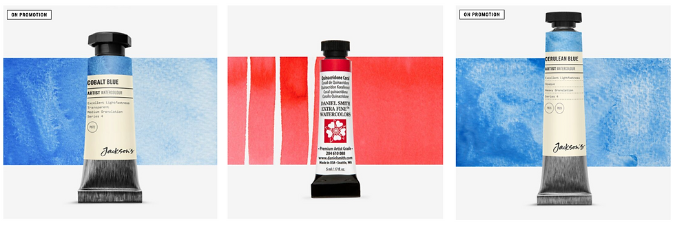
Colour Combo 4 - Quinacridone Coral, Cobalt Blue Hue & Cerulean Blue.
Layering the Base Wash
Once your base drawing is complete, it's time to start with a light base wash of colour to all areas. The most important key here is to keep your tints VERY light, as you can always add strength later, so use very minimal amounts of pigment. Wash in the background first and then concentrate on the blooms and the birds. Using a wet-on-wet technique allows tints and colours to blend beautifully on the paper. As you apply the base wash, intentionally leave some areas of white paper to create highlights (you can also lift off light base washes with a scrunched-up tissue to get your highlights while your washes are still wet). Layering techniques add depth and dimension to your painting, making everything look more realistic. It is believed that applying well-layered base coats of pigment, building up with successive thin washes, can increase visual interest by approximately 30% (an AI fact 😀).
Adding Depth and Detail
After the base wash dries, it’s time for depth and detail. I switch to a smaller brush to define the petals and add necessary shadows. By mixing darker shades, I carefully paint areas where natural shadows fall—such as the inner petals and the spaces between blooms. Take your time to observe how light interacts with the flowers. I often use Indanthrone Blue in a very watery wash to underlay shadow areas. The movie below shows this process in another painting completed earlier this year.
Ensure you work on your painting by 'dotting' around it, making sure each petal next to the one you're painting is fully dry. This prevents the petals from bleeding into each other. This method differs significantly from the techniques used by many other watercolour artists, but it's a system I have developed and love. I believe it offers a level of control over watercolour that can often be elusive in this medium.
The movie below shows petal painting in ‘Of Songs & Roses’
Don’t rush this process; take your time to observe how light interacts with the flowers and to build your layers and depths of colour. Paying close attention to how light and shade fall on each petal as you build up the thin layers will help you make informed decisions about where to place your shadows and highlights.
Incorporating the Rose Finches
As the roses come alive, I will turn to the rose finches to complete the scene. These delightful birds add an engaging layer to the composition. I have already started the base washes on the main character in the center and will add soft browns and gentle pinks next to reflect its natural colouring.

When painting the birds, pay special attention to their unique features—like the shapes of their beaks and feather textures. This attention to detail will help them stand out against the floral backdrop. Studies show that attention to detail can enhance a piece’s overall appeal by 40% (another fun AI fact😂🤣), so this step is crucial.
While painting, I frequently step back to assess my progress and make any needed adjustments. Viewing the artwork in a large mirror is particularly beneficial, as it alters your perspective and reveals areas for improvement. I strongly suggest trying this approach.
Embracing the Process
Throughout my painting experience, I’ve found that the journey is just as important as the final piece. Embrace the unpredictability of watercolour. Each brushstroke is a chance to express yourself creatively. Mistakes are part of your learning curve. If something goes awry, don’t be disheartened. Instead, see it as an opportunity for growth and experimentation as an artist.
Final Thoughts
Crafting vibrant watercolour flowers is a fulfilling experience that enables me to connect with nature and express my artistic vision. I hope the tips and techniques shared above help you approach your own painting with greater confidence. Whether you're a beginner or an experienced artist, remember that the journey of painting is as beautiful as the artwork itself. So pick up your brushes, let your creativity flow, and allow the world of watercolour flowers to inspire you as well! Visit my blog next month to see the finished painting.
Thank you for your time. Please like and subscribe to my blog through my website for more updates on my Art & Gardening Journey.


Comments